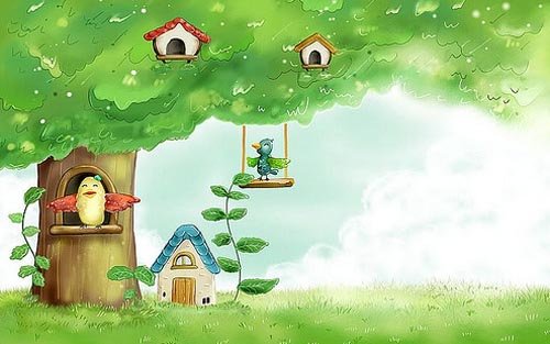
Character design can be a tricky beast to tackle, because although many of the classic characters familiar to us all through cartoons, entertainment and advertising look simple, that simplicity usually belies the many hours of work that have gone into their development.
Getting started can be the trickiest part in any character development project, but once you’ve got some ideas these tips will help you breath life into your creation…
1: Research and evaluate
It can be helpful to try and deconstruct why certain characters and their characteristics work and why some don’t. There’s no shortage of research material to be found, with illustrated characters appearing everywhere: on TV commercials, cereal boxes, shop signs, stickers on fruit, animations on mobile phones, and more. Study these characters and think about what makes some successful and what in particular you like about them.
2: Design and plan
Where will the character be seen and in what medium? This will have a direct bearing on how you go about your design. For example, if the character is for a mobile-phone screen, there’s no point designing it to have a lot of intricate details and features. Nathan Jurevicius says, regardless of the format, “The process of thinking up concepts always starts the same: paper, pencil, green tea... lots of thumbnails, written ideas, scratches and sketches over sketches.”
3: Who is it aimed at ?
Think about your audience. Characters aimed at young children, for example, are typically designed around basic shapes and bright colours. If you’re working for a client, the character’s target audience is usually predetermined, as Nathan Jurevicius explains: “Commissioned characters are usually more restrictive but no less creative. Clients have specific needs but also want me to do my ‘thing’. Usually, I’ll break down the core features and personality. For example, if the eyes are important then I’ll focus the whole design around the face, making this the key feature that stands out.”
4: Visual impact
Whether you’re creating a monkey, robot or monster, you can guarantee there are going to be a hundred other similar creations out there. Your character needs to be strong and interesting in a visual sense to get people’s attention. When devising The Simpsons, Matt Groening knew he had to offer the viewers something different. He reckoned that when viewers were flicking through TV channels and came across the show, the characters’ unusually bright yellow skin colour would grab their attention.
5: Line qualities and styles
The drawn lines of which your character is composed can go some way to describing it. Thick, even, soft and round lines may suggest an approachable, cute character, whereas sharp, scratchy and uneven lines might point to an uneasy and erratic character. Sune Ehlers characters are bold and seem to dance on the page, which echoes his approach to drawing them. He explains: “Drawing a doodle is about decisive pen-manoeuvring. A strong line for me comes from strength and rhythm.”
6: Exaggerated characteristics
Exaggerating the defining features of your character will help it appear larger than life. Exaggerated features will also help viewers to identif y the character’s key qualities. Exaggeration is key in cartoon caricatures and helps emphasise certain personality traits. If your character is strong, don’t just give it normal-sized bulging arms, soup them up so that they’re five times as big as they should be!
7: Colour me bad
Colours can help communicate a character’s personality. Typically, dark colours such as black, purples and greys depict baddies with malevolent intentions. Light colours such as white, blues, pinks and yellows express innocence, good and purity. Comic-book reds, yellows and blues might go some way to giving hero qualities to a character.
8: Adding accessories
Props and clothing can help to emphasise character traits and their background. For example, scruffy clothes can be used for poor characters, and lots of diamonds and bling for tasteless rich ones. Accessories can also be more literal extensions of your character’s personality, such as a parrot on a pirate’s shoulder or a maggot in a ghoul’s skull.
9: The third dimension
Depending on what you have planned for your character, you might need to work out what it will look like from all angles. A seemingly flat character can take on a whole new persona when seen from the side if, for example, it has a massive beer belly. If your character is going to exist within a 3D world, as an animation or even as a toy, working out its height, weight and physical shape is all important.
10: Conveying personality
Interesting looks alone do not necessarily make for a good character; its personality is key as well. A character’s personality can be revealed through comic strips and animations, where we see how it reacts to certain situations. The personality of your character doesn’t have to be particularly agreeable, but it does need to be interesting (unless your characters is purposely dull). Personality can also be expressed simply in how the character has been drawn.
11: Express yourself
Expressions showing a character’s range of emotions and depicting its ups and downs will further flesh out your character. Depending on its personality, a figure’s emotions might be muted and wry or explosive and wildly exaggerated. Classic examples of this can be found in the work of the legendary Tex Avery: the eyes of his Wild Wolf character often pop out of its head when it’s excited. Another example of how expressions communicate motions is deadpan Droopy, who barely registers any sort of emotion at all.
12: Goals and dreams
The driving force behind a character’s personality is what it wants to achieve. This missing ‘something’ – be it riches, a girlfriend or solving a mystery – can help to create the dramatic thrust behind the stories and adventures your character gets up to. Often the incompleteness or flaws in a character are what make it interesting.
13: Building back stories
If you’re planning for your character to exist within comics and animations then developing its back story is important. Where it comes from, how it came to exist and any life-changing events it has experienced are going to help back up the solidity of, and subsequent belief in, your character. Sometimes the telling of a character’s back story can be more interesting than the character’s present adventures… or not, in the case of the Star Wars prequels.
14: Quick on the draw
Don’t be afraid to experiment and ignore all the rules and tips about planning and crafting the look of your character. Going against what is supposed to be the right way of doing something could create unexpected and exciting results. When artist Yuck creates his characters he doesn’t really know what he’ll draw. “I just listen to music and draw the result dependent on my mood: freaky or cute. I always want to have a drawing that I find interesting. I then work more on the character after it’s okay with me and my brain,” he says.
15: Hone, plan and polish
Instead of just drawing or doodling without too much pre-planning, Nathan Jurevicius prefers to take a different approach. “I take a long time creating finished looking roughs and also thinking about how the character could be expanded beyond a 2D artwork, what the character will do in a specific world, and how it speaks and acts,” he says.
16: Drawn in mud
Having decent materials to work with is useful, but not essential, for the early planning of your character. A lot of amazing characters were successfully designed years ago when no one had personal computers and Photoshop was just a dream. The drawings of your character should still work when rendered on paper with a simple pen or, as Sune Ehlers puts it, “The character should still be able to work with a stick dipped in mud and drawn on asphalt.”
17: Real-world drawing
Ian, of I Like Drawing, generates some of his characters away from both the computer and the sketchbook, allowing outside elements to influence his work. “I really like characters that interact with their surroundings,” he says. “The environment normally suggests an idea and then I let my strange mind do the rest. I prefer drawing in the real world with a pen instead of on the computer, because it feels good and odd things happen.”
18: Release the beast
Show people your creations and ask them what they think. Don’t just ask whether they like them or not. Instead, see if they can pick up the personalities and traits of your characters. Find who you think is the suitable or ideal audience for your work and get feedback specifically from them about it.
19: Beyond the character
In the same way that you create a history for your character, you need to create an environment for it to help further cement believability in your creation. The world in which the character lives and interacts should in some way make sense to who the character is and what it gets up to.
20: Fine-tuning a figure
Question each element of your creation, especially things such as its facial features. The slightest alteration can have a great effect on how your character is perceived. Illustrator Neil McFarland advises: “Think about the meaning of the word ‘character’. You’re supposed to breath life into these things, make them appealing and give them the magic that will allow people to imagine what they’re like to meet and how they might move. I think it’s strange how creating characters for the sake of it has become a distinct branch of graphic design.”
Thursday, September 4, 2008
Best character design tips
Tuesday, August 5, 2008
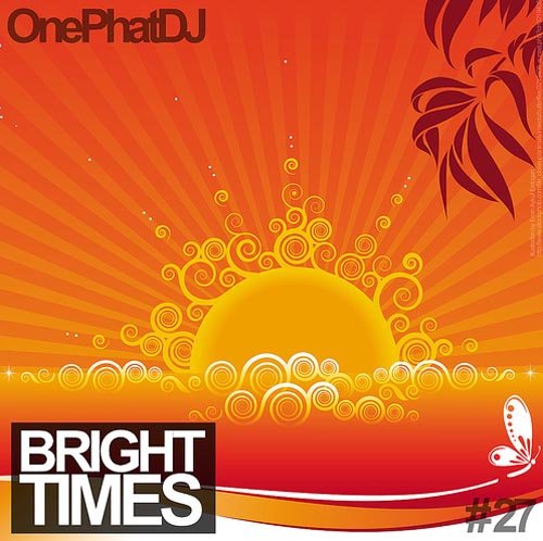
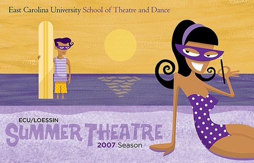
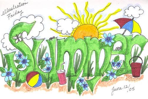
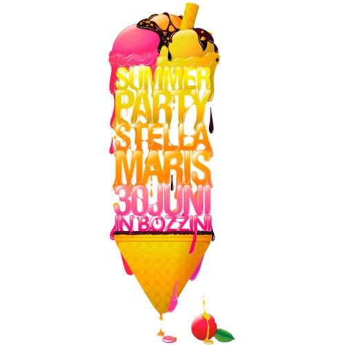
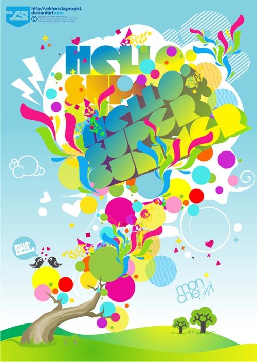
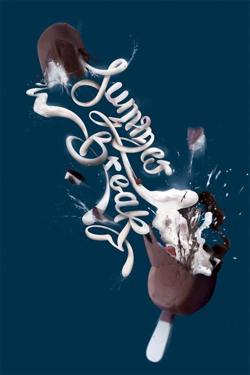
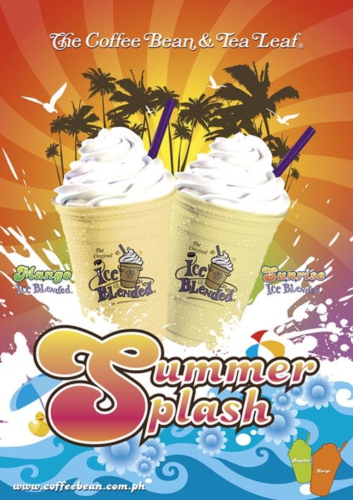
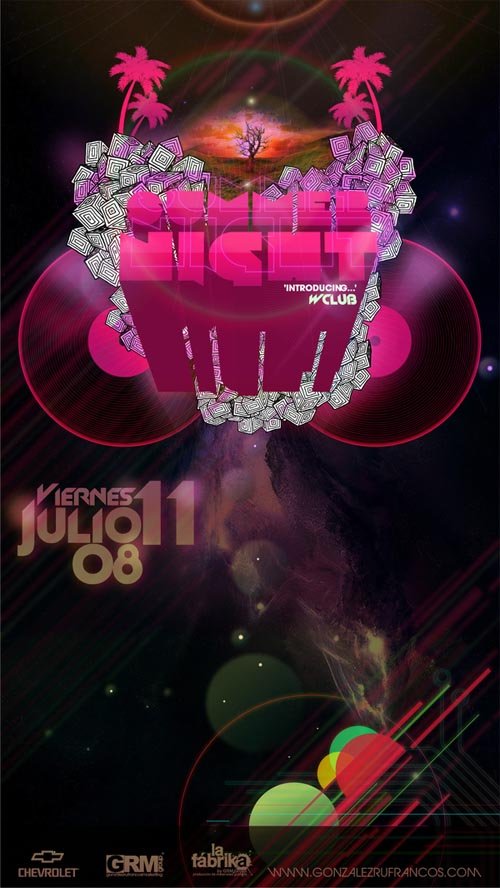
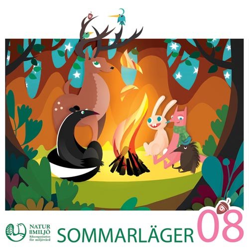
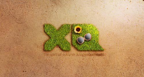
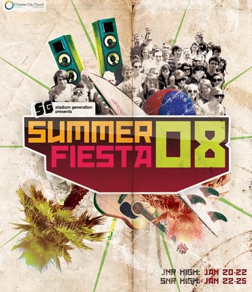
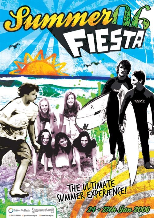
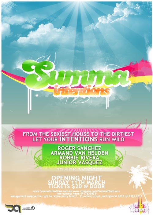
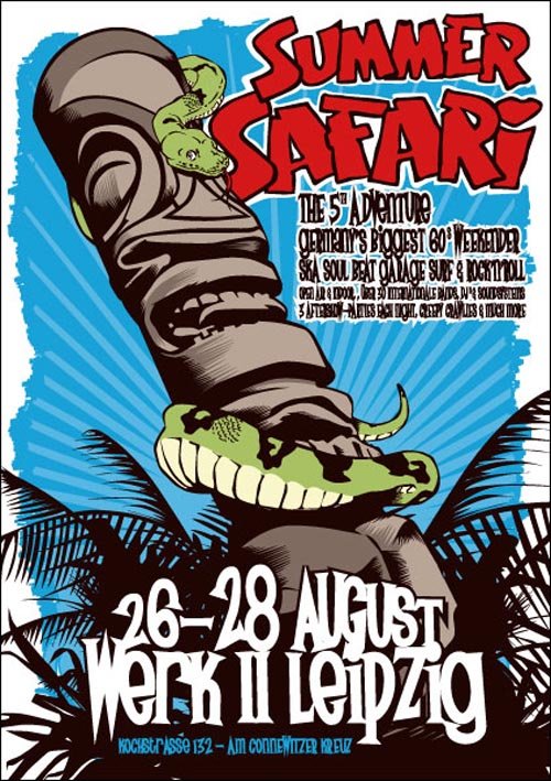
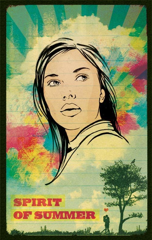
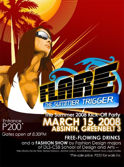
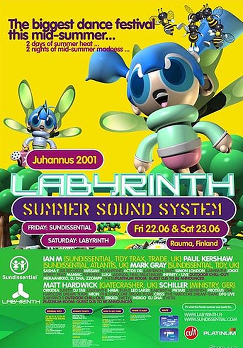
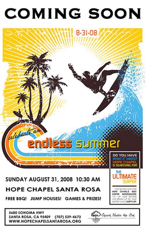
Great Poster Design & Summer illustrations design
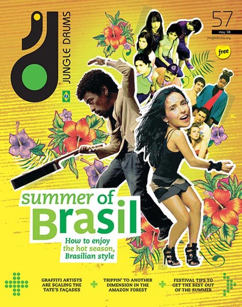
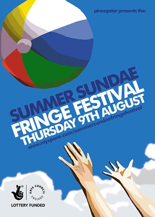
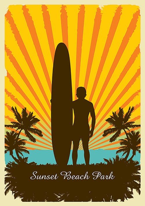
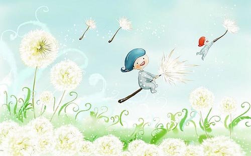
27 most refreshing summer illustrations and poster designs for you. They have listed here because of their creative illustrations, attractive preview, bright colors, nice presentation, mind blowing imagination, cool combinations and top of all because they showed the feel refreshment in summer.
Thursday, June 26, 2008
Modern Menu Design

1. Open a new document 500x40px and fill it with black.
2. Draw 5 straight lines similar to these( ) measuring 1 px in height on the top of the canvas(on a new layer).
3. Select the Rectangular Marquee Tool and draw a shape similar to this one and then right click -> New layer. Fill this new layer with the following gradient:


4. Do the same rectangle shape again above this one but under the lines that were made at 2. and fill it with this gradient:

5. Draw a small rectangle shape with the Rectangular Marquee Tool, create a new layer as in the previous procedure and then go to Select - Modify - Smooth - 1px and after that Layer - Add layer mask - Reveal selection. After doing that right click on the layer in the layer palette and select Blending Options. Use the following options:


6. You can now duplicate the shape and add text and maybe an icon to it and you have a modern menu.
Monday, May 12, 2008
Successful Print Design
1 – Don’t crowd your limited space with too many elements. This is particularly true for marketing collaterals that only have a small space to work with (e.g. postcards, business cards, flyers, etc.). Leave ample space for your target audience to rest their eyes (this is what you call white space). More elements will only distract rather than enhance your message, which is the most important aspect of your marketing collateral.
2 - Consider using large images and pictures instead of small ones. They attract higher readership and appreciation.
3 – More visuals tend to attract more than words. Hence, use your illustrations and print design to enhance and emphasize your message. If you can, produce an image that is almost half the size of your entire page to prove your point.
4 – Consider designing a layout that your target audience would actually read through. Don’t let a space or text go unread. Strategically place your print design and text to help you scatter your target reader’s viewing all over your print ad.
5 – Be careful with how you use your fonts and types. For an effective communication tool, avoid using too many capital letters. Your text would come off as very stiff and loud. Our eyes tend to be more appreciative of lower case letters that’s why you have to provide normal writing to your marketing collateral for easy reading.
6 – Consistency is key. Placing your information in the same place where your target readers expect them can make for a better reading material that can be easily remembered.
7 – Again consistency must be present in your page layout and other design elements.
Source : What To Remember For Successful Print Designs
Tuesday, April 8, 2008
Social Media sites for Web Designers
If you are a web designer, there are a number of niche sites that you should be aware of. Here are five with a brief description of each.
1. DZone

DZone is a community of web developers and software developers, and it probably provides the most technical content of any of the sites listed here. As the largest community listed, DZone also has the potential to send more traffic than any of the others.
How it works:
- You create an account.
- Users can submit a link to an article that is development-related.
- Members can vote up or down for the articles.
- Anyone can subscribe to the RSS feed.
- Currently, there are over 9,000 subscribers to the feed of popular links.
- Currently, there are over 1,000 subscribers to the feed of new links.
A submitted link doesn’t need to get that many votes in order to be made popular, but votes don’t come easily. The content is highly targeted, and anything non-developer related will be shot down and probably deleted. If one of your links makes it to the front page (and gets sent out to the 9,000+ subscribers) you can easily receive 500 or more visitors in a day. The DZone community seems to include a large number of del.icio.us users as I have had several posts rack up bookmarks and make it to the front page of del.icio.us immediately following traffic from DZone.
2. CSS Globe

CSS Globe is not a typical social media site where members vote on submissions. It specializes in web standards and design-related content.
How it works:
- Members create an account (have to be approved).
- Members can submit links with brief descriptions.
- The links go out to CSS Globes RSS subscribers.
So essentially CSS Globe is more of a user-controlled blog than a social media website. But it sends links with descriptions rather than full blog posts. Links can receive as much as 200 or more visitors in a day from CSS Globe. Actually, this week I’ve had over 400 visitors in a day from CSS Globe. If you have quality design-related content and a good headline, CSS Globe is easy traffic.
3. Pixel Groovy
![]()
Pixel Groovy is a user-controlled tutorial directory. Topics include CSS, PHP, JavaScript, Flash, Photoshop, Illustrator, and more.
How it works:
- Members create an account.
- Members submit links to tutorials/articles.
- Submissions are voted up and down by users.
Pixel Groovy’s RSS feed currently has over 1200 subscribers. I’m not sure how much traffic it sends to top stories because I have not used it very much.
4. Design Float

Design Float is a Digg-Style social media site that focuses on design related content, as opposed to Digg’s general approach.
How it works:
- Members create accounts.
- Members can submit links and vote (actually “float”) on other submissions.
- Much like Digg, users can add friends.
- Top stories are posted on the front page.
I’ve submitted to articles to Design Float and been pleasantly surprised with the results (100 - 200 visitors to each). It appears to be an up-and-coming community for designers.
5. DevelopersNiche

Like Design Float, DevelopersNiche is a Digg-style site, with a niche focus. It works exactly the same as Design Float, so I won’t re-write that information. DevelopersNiche is the smallest community of the sites listed here and will send the least amount of traffic. However, that means it is easier to get your submissions to the front page and get a little bit of exposure.
Source : 5 Niche Social media sites for Web Designers
Wednesday, February 13, 2008
CSS based Design - Website Design Tips
53 CSS-based techniques you should always have ready to hand if you develop web-sites.


3. CSS Tabs

4. CSS Bar Graphs (CSS For Bar Graphs)

5. Collapsing Tables: An Example

6. Adam’s Radio & Checkbox Customisation Method


8. CSS Shadows (CSS Shadows Roundup)

9. CSS Rounded Corners Roundup (Nifty Corners)

10. Drop Cap - Capital Letters with CSS

11. Define Image Opacity with CSS

12. How to Create a Block Hover Effect for a List of Links

13. Pullquotes with CSS (Automatic Pullquotes with JavaScript and CSS

14. CSS Diagrams

15. CSS Curves

16. Footer Stick allows for the footer of a Web page to appear either at the bottom of the browser window or the bottom of the Web page content – whichever is visually lowest.

17. CSS Image Map

18. CSS Image Pop-Up


20. CSS Image Replacement for Buttons

21. Link Thumbnail

22. CSS Map Pop

23. PHP-based CSS Style Switcher

24. CSS Unordered List Calender (CSS Styled Calender)

25. CSS-Based Forms: Techniques

26. CSS-Based Tables: Techniques

27. Printing Web-Documents and CSS

28. Improved Links-Display for Print-Layouts with CSS


30. CSS Teaser Box

31. CSS Tricks for Custom Bullets


33. CSS Zooming

34. Creating a Star Rater using CSS

35. The ways to style visited Links

36. PDF, ZIP, DOC Links Labeling

37. Displaying Percentages with CSS

38. Image Floats without the Text Wrap

39. Let visitors decide, whether or not will they open link in a new window

40. Simple accessible external links

41. Zebra Table with JavaScript and CSS

42. Vertical Centering with CSS (Horizontal and Vertical Centering with CSS


44. Image Caption with CSS (Styled Images with Caption)


47. Hierarchical Sitemap with CSS

48. Snook’s Resizable Underlines

49. Switchy McLayout: An Adaptive Layout Technique

50. StyleMap: CSS+HTML Visual Sitemap


